Style guide for effective graphs
Purpose of this guide
This guide provides practical advice for the production of clear and informative graphs. It will help you understand the principles of effective data presentation and can act as a helpful resource in your your studies or work.
In the physical sciences, the primary purpose of graphs is data presentation. The most common form of graph is one in which some gathered data y are plotted against an independent variable x to illustrate their relationship. This is the focus of this guide.
Objectives
A graph is effective if it:
- Conveys information easily, with minimal reading.
- Is not confusing or ambiguous.
- Is appealing enough to hold your reader’s attention.
These are your main objectives in graph production. In the next section, attention is given to those elements of graphs, such as text size, line styles and annotation, which help you achieve these objectives.
Graph elements
For the points listed in the next sections you will find good practice represented in figures 1 to 6. In your own work, try to emulate the style shown here.
Axes style
- Choose axes limits such that space in the graph is not wasted. This means minimising empty whitespace inside the axes.
- Enclose the plot area with a ‘box’ of the axes lines. This delineates the graph from surrounding text.
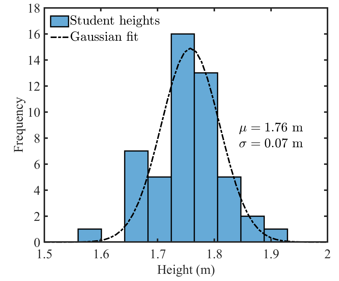
- Gridlines (the faint grey lines in figure 2) are not necessary, but can aid readability and improve visual appeal.
Text size and font
- All graph text should be easily readable and there should not be large variation in text size across the various graph elements; axes titles, legend, tick labels, etc. This is best achieved by specifying text size similar to that of the surrounding document.
- The typeface or ‘font’ should be the same as in the surrounding document.
Axes titles
- Axes titles must be understandable within the context of the surrounding document.
- Titles should be as concise as possible.
- For physical properties, axes titles must provide the units. Express units like this; Current, mA.
- Symbols can be used in titles as long as they are defined in the document text before the graph is shown.
- Where symbols are used for variable names, they should be in italic font, e.g., I, ε, ΔP.
- The units should be in normal font, as shown in figures 2 and 6.
- Use SI units and prefixes, e.g., W, J, nm, kN.
Tick style and labels
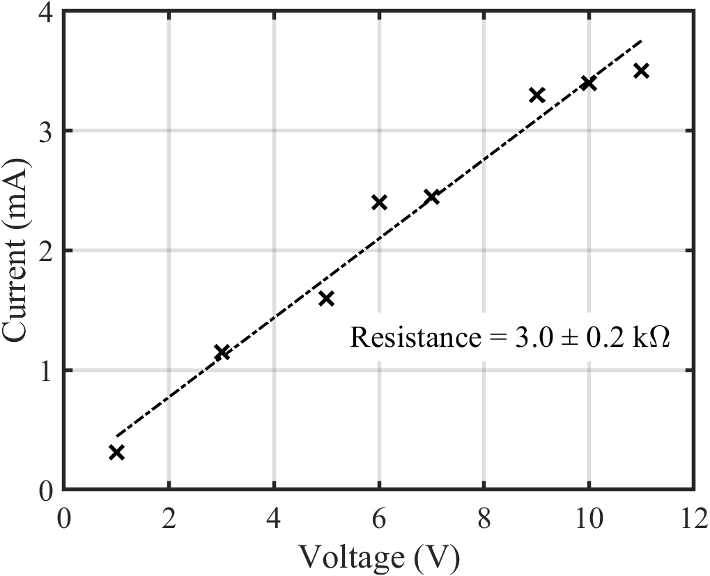
- Avoid tick labels with lots of 0’s by using appropriate units and prefixes. See figure 1, which uses y axis tick labels of 1 to 4 mA, rather than 0.001 to 0.004 A.
- Ticks, the short lines which gradate the axes, can be positioned inside the axes, outside, or both. All three styles are represented in this guide. Ensure consistency of style throughout the document.
Logarithmic axes
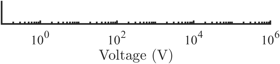
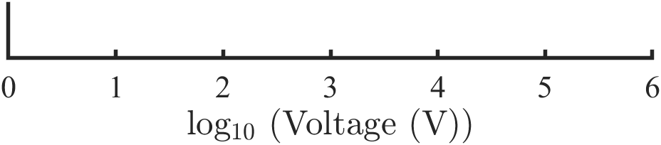
If the x or y data range spans orders of magnitude, logarithmic axes scales may be needed. There are two ways to do this; (i) apply log scaling directly to the tick labels, as shown in figure 3, or (ii) apply log scaling to the data before plotting, as shown in figure 4. The second approach requires modified axes titles to reflect the mathematical transformation. Both of these are acceptable, but they must not be applied simultaneously.
Marker styles and line styles
- Data markers should be large enough to see clearly, but not so large that their value cannot be identified by referring to the axes.
- Lines should not be so thick as to obscure any underlying data markers, and should not be significantly thicker or thinner than the axes lines.
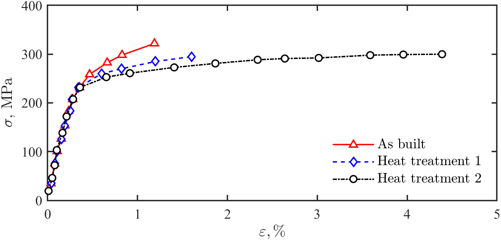
- For discrete data, markers should generally not be joined with line segments like this —×—, but for some smoothly varying data it may improve the clarity of the graph (see figure 2).
Multiple data sets
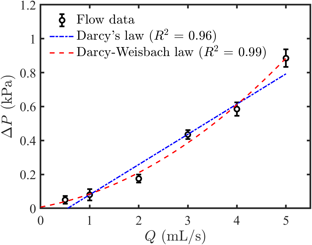
To distinguish between data sets, varying both line style and colour is better than just one of those properties (e.g., figure 6).
Whitespace
Minimise the amount of empty whitespace inside the graph axes. This is done through selection of the axes limits, and by placing the legend and any annotation appropriately.
The legend
- A legend is needed to help the reader distinguish between multiple data sets. It should include a concise and informative name for each data set and illustrate the marker or line style.
- For a single data set and linear fit, a legend may not significantly improve clarity so can be omitted. For example, figure 1 is easy to understand without a legend. For more complex data and fitting, a legend may be needed to understand the graph (see figures 5 and 6).
Annotation
- Annotation is used to convey information that is not obvious through inspection of the data. This includes useful fit results like the text in figures 1and 5.
- Do not include annotation unnecessarily. It can detract from the neatness of the graph.
- For linear fits, do not label your fit y = mx + c, unless the axes titles happen to be x and y. Use the correct variable names instead.
Error bars
- When data uncertainty is known, this should be represented with error bars stemming from the data markers (see figure 6).
- These should end with short horizontal lines and have thickness consistent with the data markers.
- The length of the error bars should reflect the uncertainty of the plotted data. This will likely be either; (i) the precision of the data, if read from an analogue or digital measurement device, or (ii) a statistical representation of the data range, typically the standard deviation, if numerous readings are taken.
For example, the rightmost data point in figure 6 is 0.89 ± 0.05 kPa, so the error bars extend 0.05 kPa above and below the marker.
Line of best fit
- Add a fit line only if it contributes to your analysis or description of the data.
- A fit line must have a mathematical basis which is relevant to the data. For example, a linear fit is suitable in figure 1 because the data is connected through I = V/R. Likewise, both fits in 6 are known appropriate models for flow data.
Applying a quadratic fit in figure 1 or an exponential fit in figure 6 would be inappropriate, even if they provide excellent descriptions of the data, since there is no theoretical justification for those models. - Do not extend the fit line beyond the range of data to which it is fit.
- Goodness of fit statistics, like R 2 or root-mean-squared-error, should be added to the graph if competing mathematical models are applied to the data (see figure 6). This shows which model provides the more accurate description of the data.
If only a single fit is applied, the goodness of fit may be given in the figure caption or text of the document.
Figure caption
- Figure captions are placed immediately below the figure (the graph) in the document and help the reader understand its content.
- They must include a figure number, which is then referred to in the text when describing the data.
- A graph title is not needed in addition to the caption.
- Avoid non-informative captions like: A graph to show current against voltage.
A suitable caption for figure 1 in this guide would be: Experimental data with a linear regression fit representing Ohm’s law (R 2 = 0.97).
And for figure 6: Determination of flow type from recorded pressure drop data.
Exporting graphics properly
- Ensure that good quality images are exported for use in your reports by using the Save as or Export tools found in most graphing software and specifying high-resolution output. The bitmap .png format is suitable in most cases, especially if the graph is to be embedded in a Microsoft Word document or PowerPoint slide. But ensure the resolution is above 100 dpi.
- Do not specify extremely high bitmap resolutions unnecessarily. If several .png files of a few MB each are included in a report document, it will become slow to open and edit.
- Vector graphics formats like .eps and .pdf are also suitable, and are commonly used in dissertations and publication-quality reports created using LaTeX. These have smaller file sizes compared to bitmap formats and do not have innate resolutions, meaning that they can look good scaled to any size.
- Do not capture a screenshot of your graph and copy the image into your report. The end result will appear blurry and unprofessional.
Final comments
Creating high-quality graphs takes time and practice. If you follow the points laid out here and emulate the style of the presented figures, you will be able to produce clear and appealing graphs that convey information easily to your audience.
This guide covers the main principles of clear data presentation, but does not delve into uncertainty or fitting interpretation. These are closely entwined with data analysis, which varies greatly with the origin and type of the gathered data, as well as the overall aim of the report, so guidance in those areas should be sought from module conveners, lab demonstrators or project supervisors as needed.